What this tool does
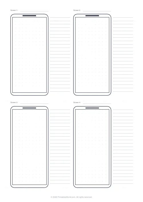
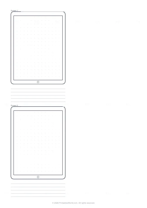
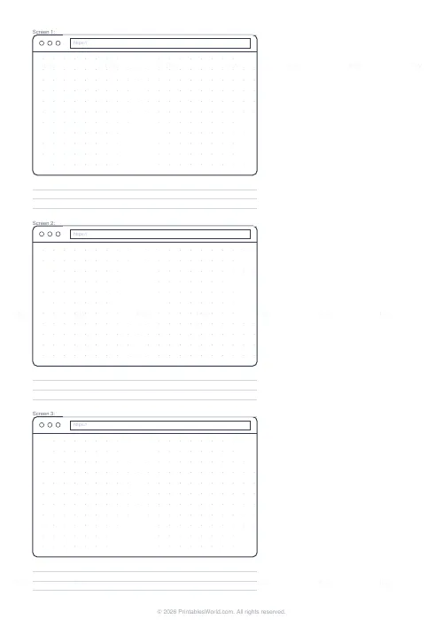
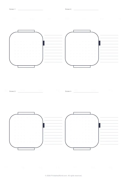
Blank device frames for sketching interfaces: phones at 9:19.5, tablets at 3:4, browser windows with a tab bar and address field, and round-cornered watch faces. Each frame carries a faint 5 mm dot grid and a screen number line, with ruled notes beside or below, so a flow can be drawn screen by screen and annotated.
People also used
Feedback
Spotted something off with this tool?
Sketch before you build
Every interface designer's first tool is a pen. A frame at the right proportions keeps the sketch honest: a phone screen is tall and narrow, and a layout that looks fine in a square doodle falls apart at 9 by 19.5. These sheets give you the frame, a dot grid inside it to keep things aligned, and space to write what each screen does.
Devices
Phone frames come two, four or six to a page, in a modern tall ratio with a small notch. Tablet frames come one or two to a page at 3:4 with a home button. Browser frames have the three window buttons, a tab bar and an address field, one to three per page. Watch frames are rounded squares with a crown and strap lugs, four to eight per page. Every frame has a Screen number line above it so a flow reads in order.
Grid and notes
Inside each frame is a 5 mm dot grid, faint enough to ignore and there when you want a straight edge or an even column. Turn it off for a blank screen. Note lines sit beside phone and watch frames and below tablet and browser frames; turn those off for more frames per page.
Working with the sheets
Number the screens and draw arrows between frames for a user flow. Photograph the sheet and drop it into a design tool as a reference layer. Keep the sheets: a stack of sketched screens is a record of decisions that a finished design does not show.
FAQs
Quick answers
Which devices are included?
Phone (2, 4 or 6 per page), tablet (1 or 2), browser window (1 to 3) and smartwatch (4, 6 or 8).
Are the proportions accurate?
Phone frames are 9:19.5, tablets 3:4, browsers 16:10 and watches square with rounded corners, which covers current devices closely enough for sketching.
Can I turn the dot grid off?
Yes, untick 5 mm dot grid for a blank screen.
What are the note lines for?
Annotating each screen: what it does, what tapping each element leads to. Turn them off for more frames on the page.
Can I print it in landscape?
The sheet is portrait. Browser frames are wide, so they print one above the other.
Related tools
Dot Grid Paper
Subtle 5 mm dot grid. Perfect for bullet journalling and notes.
Storyboard Template
Six 16:9 frames in a 2×3 grid with caption strips for film and animation.
Graph Paper Generator
Create custom graph paper PDFs with square or rectangular grids, dot styles, and axis numbering.
Comic Strip Template: 6 Panel
Six numbered panels for medium-length comic strips.
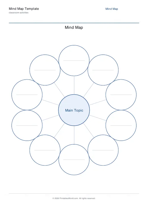
Mind Map Template
Central topic with radial branches, configurable branch count.
Further reading
Printable Paper
Bullet journalling with dot grid paper: a starter guide
The bullet journal was designed to be fast, not beautiful. Here is the original system, why dot grid suits it better than lines or blank, and the four pages you actually need.
5 min read
Printable Paper
The best note-taking paper for students (Cornell, grid, lined)
The paper you take notes on quietly decides how you review them. Here is what each format is actually for, and which subjects each suits.
4 min read
Printable Paper
Graph paper sizes: which grid for which task
What graph paper sizes and grid spacings mean, how to match a grid to maths, art or design, and how to set it all in the free graph paper generator.
7 min read